Surprising fact: one study found 50% of marketers saw higher conversion rates after using value-first offers, and 82% of buyers say video convinced them to act — proof that the right incentive can change results fast.
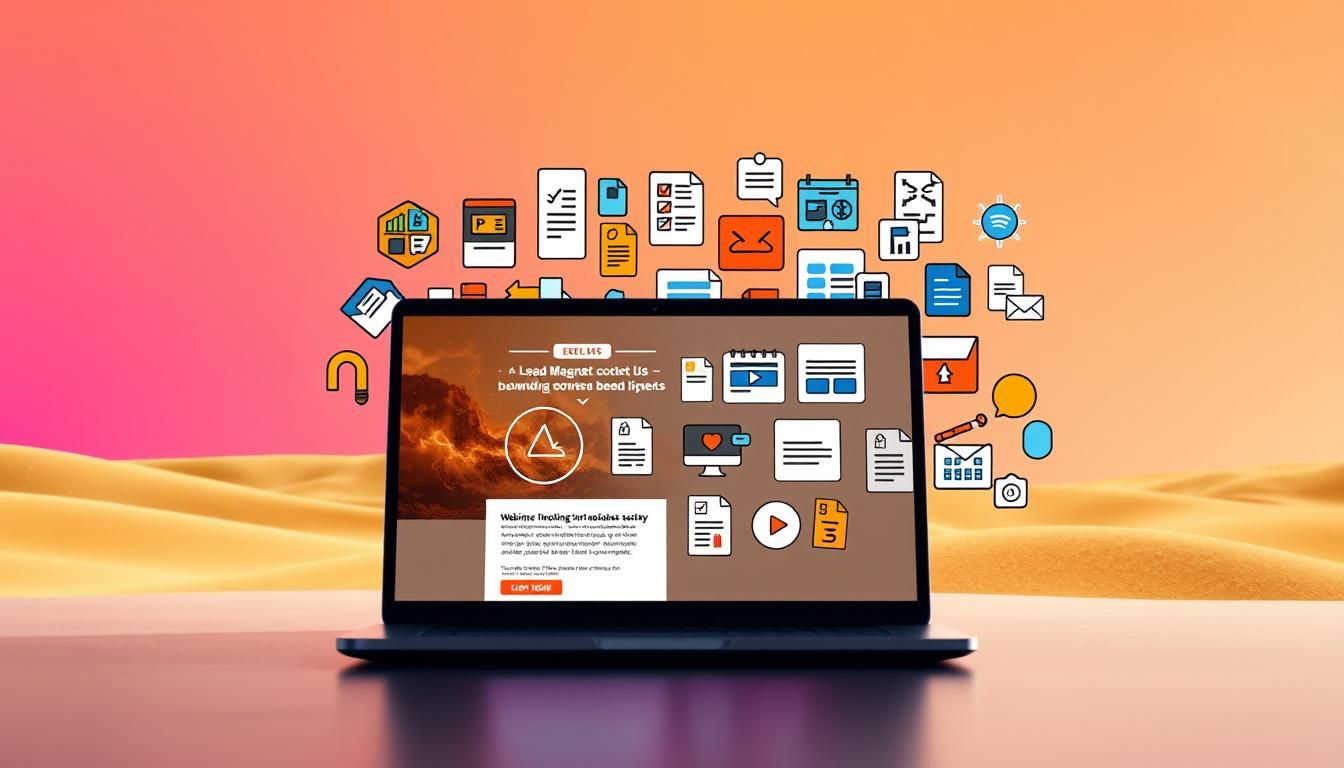
A lead magnet is a short, useful offer exchanged for an email or contact detail. For high-converting landing page templates specifically designed for affiliate marketing, check out our proven affiliate landing templates. Think templates, checklists, trials, webinars, or compact courses that match your audience’s needs.
This guide shows why a dedicated landing page helps you highlight benefits, cut friction, and capture consented info cleanly. For step-by-step strategies on creating effective freebies, explore our guide on generating leads with freebies. You’ll learn how to choose the right offer for search intent, design effective on-page elements, and build post-opt-in workflows that nurture prospects over time.
We blend strategy with real examples from HubSpot, ActiveCampaign, and Pat Flynn so teams and founders can act immediately. To expand your reach through strategic partnerships, explore our guide on cross-promotion techniques with niche newsletters. Expect practical tips on formats, testing, promotion, and measuring business impact for long-term growth.
Key Takeaways
- Value-first offers boost signups and conversions.
- A focused landing page reduces friction and clarifies benefits.
- Choose formats that fit your audience and intent.
- Measure, test, and iterate for sustained gains over time.
- Combine on-page design with welcome and nurture emails.
- Real brand examples make tactics easy to copy and adapt.
What are lead magnets and why your landing page is the best place to capture them
A lead magnet is simply a useful resource you give in exchange for a visitor’s email and basic contact information. Examples include ebooks, checklists, webinars, calculators, and free trials. The idea is to start a permission-based relationship by trading immediate help for minimal data.
A dedicated landing page focuses messaging on one clear offer. It removes distractions like wide navigation and aligns the headline, visuals, and proof to a specific audience. That focused setup reduces exits and makes conversion the main action.
These magnet landing pages also let you tailor copy and forms by segment. Short forms collect the right data for segmentation without overwhelming visitors. Clear privacy notes further increase trust.
Delivering upfront value builds credibility fast. Prospects enter your funnel warmer and more willing to engage. For business impact, expect faster list growth, better-qualified contacts, and more predictable downstream conversions.
- When to use what: templates and checklists for quick wins; webinars and reports for deeper education; trials and calculators for evaluation.
Understanding search intent for landing page lead magnets today
Users arrive with different goals — some want to learn, others to evaluate — and your offer must reflect that. Intent shapes which offer and form you show, and it changes how visitors respond.
Informational intent seekers want clear information, examples, and frameworks. Good fits include checklists, templates, ebooks, and short webinars. These often convert with simple forms that ask only for an email. Text-based content performs especially well for startups and SMBs.
Commercial intent users are evaluating solutions. Trials, demos, calculators, and consultations work best. They accept slightly longer forms when the value matches their readiness. Multi-step flows or progress indicators can help—multi-step forms can lift completion rates by about 86% versus single-step forms.

“Match the query—‘how to’ or ‘template’ vs. ‘pricing’ or ‘demo’—to your headline and CTA to reduce friction.”
- Use analytics to map which queries cluster by intent.
- Pair blog content with contextual offers to improve relevance.
- Collect minimal, useful data (role or goal) to tailor follow-ups.
| Intent | Best offer types | Form strategy | Format notes |
|---|---|---|---|
| Informational | Checklists, templates, ebooks | Email-only or single field | Text often wins for SMBs |
| Commercial | Trials, demos, calculators | Staged forms, progress indicators | Video resonates across company sizes |
| Hybrid | Webinars, reports, tool previews | Short segmentation fields | Use examples and data to prove value |
The business case: how dedicated lead magnet landing pages lift conversion rates
A focused offer page turns casual visitors into subscribers by removing noise and spotlighting clear value.
About half of marketers use a lead magnet to capture an email and report an average conversion near 21%. Multi-step forms can boost completion, producing up to 86% higher conversion than single-step flows. Those numbers show the real upside of a focused opt-in destination.
Focused conversion and fewer distractions
Removing global navigation and competing links channels attention toward the offer. A single-focus design guides visitors to one clear action. That clarity reduces exits and lifts short-term conversion.
Trust-building with social proof and value-first content
Reframe the exchange from “give me your email” to “get immediate value.” Introductory content that helps users first increases perceived fairness.
“Quantified testimonials and trusted logos lower perceived risk and speed opt-ins.”
- Quantify the upside: 21% mean conversion; 86% uplift with staged forms.
- Social proof: use numbers, logos, and awards to build credibility.
- Privacy clarity: short assurances and “no spam” reduce friction.
- Progressive profiling: collect extra data across steps to keep conversion high.
- Measure beyond opt-ins: track demo requests, revenue influenced, and sales funnel progress.
| Benefit | Evidence | Action |
|---|---|---|
| Higher conversion | Avg. 21% opt-in rate | Use focused offers and minimal fields |
| Better qualification | Progressive fields for segmentation | Stage form questions after initial opt-in |
| Stronger trust | Testimonials, logos, awards | Place proof near the form and CTA |
Run A/B tests that remove distractions, vary proof placement, and compare single vs. multi-step flows. Track both initial conversion and downstream metrics to prove business and sales impact.
Landing page lead magnets: high-performing types to consider
Choose the right offer and you deliver instant value that earns a visitor’s trust. Below are high-performing formats and when to use each.
Interactive magnets
Quizzes, polls, demos, calculators, and graders give instant, personalized feedback. They work well for commercial intent because they benchmark needs.
Example: HubSpot’s Website Grader asks only for a URL and email, plus a privacy note, and converts well.
Written resources
Ebooks, guides, whitepapers, case studies, templates, and checklists build authority. Use previews or templates to make the asset tangible.
Video-based value
Webinar sessions, recorded trainings, and short series boost engagement. Video converts—88% of marketers value video and 82% of buyers act after watching.
Exclusive access and monetary offers
Free trials, invite-only communities, classes, and consultations let users experience a product or service. Discounts, free shipping, or samples also lift opt-ins—about 85% of shoppers trade data for deals.
| Type | Best use | Form strategy |
|---|---|---|
| Interactive tools | Immediate benchmarking | Short fields + privacy reassurance |
| Written resources | Depth and authority | Preview + email-only opt-in |
| Video & webinars | Engagement and proofs | Staged form for attendee details |
| Exclusive / Monetary | Experience or incentive | Clear what-you-get + short consent |
Design tip: show covers, UI screenshots, or samples. Bundles (checklist + short video) often raise perceived value and conversion in a simple, measurable way.
Real-world inspiration: lead magnet landing examples that convert
Real, proven examples show how compact offers and tight CTAs turn visitors into booked consultations and engaged signups. Below are concise case snapshots you can model to improve conversion on your own pages.
Consultation done right
Dr. TMS Therapy uses click-to-call CTAs, embedded maps, and brief copy about insurance. Quantified testimonials speed trust and increase booked consultation rates.
Assessment quiz
Henry Schein’s Practice Marketing Assessment keeps the layout minimalist and adds a progress bar. Rich fields enable instant segmentation for higher-quality follow-up.
Tool and calculator
HubSpot’s Website Grader pairs a concise form (URL + email) with privacy reassurance and an FAQ. That clarity reduces friction and lifts completion.
Checklist, webinar, and trials
AutoGrow shows a contrasting CTA and a single-field click-through form for its checklist. Board Agenda adds countdown timers and staged forms for webinars. ActiveCampaign features badges, UI screenshots, and “No credit card required” to lower perceived risk for free trials.
- Clever Girl Finance: visible video previews in a resource library.
- Kapco: whitepaper with device mockups and a table of contents preview.
- Pat Flynn: cheat sheet bundled with a walkthrough video series.
- NordVPN: simple referral steps, clear headlines, and FAQs.
“Use clear CTAs, short forms, and relevant proof to make any magnet landing page feel safe and compelling.”
How to create a great lead magnet offer that matches your target audience

Start by defining who you serve so every offer solves a real, repeatable problem. Document buyer traits: pain points, daily tasks, and decision triggers. This short research step shapes topic, tone, and format.
Define the buyer and segment from the start
Map one persona and list three common problems they face. Use a single extra opt-in field—role or team size—to enable simple segmentation without adding friction.
Solve a specific problem with actionable value
Pick one useful outcome. Promise a clear transformation in your headline and deliver it with templates, step-by-step frameworks, or a quick checklist people can use immediately.
“Validate early: run a short poll or A/B test topic interest before you produce a long asset.”
- Match format to habits: checklists for busy operators, calculators for analysts, short videos for creatives.
- Build trust with real data, short case snippets, and testimonials close to the form.
- Schedule updates for trend-driven assets to keep value fresh and relevant.
| Step | Action | Why it matters |
|---|---|---|
| Persona | Define pain, goal, behavior | Targets content and format choices |
| Segmentation | Add 1 smart field (role/team) | Improves personalization downstream |
| Validation | Poll list or test topics | Reduces wasted effort and boosts uptake |
Designing the lead magnet landing page for higher conversion
Small, purposeful design shifts can raise conversions without changing the offer itself. Start by writing a benefit-first headline that promises a clear outcome. Follow with a short subhead and three bullet-style benefits so visitors can scan and act fast.
Benefit-first headlines and scannable copy
Lead with what the user gets. Put the main benefit in the H1 and use short bullets under it. Keep paragraphs tight so readers find value in seconds.
Form strategy: minimal fields, staged forms, and UX details
Use the fewest fields possible—email alone when it suffices. For richer data, employ a staged, multi-step form so completion rates stay high.
Include inline privacy notes, microcopy about next steps, and phrases like “No credit card required” to reduce friction.
Visual hierarchy: contrast, whitespace, and imagery
Establish clear contrast between CTAs and surrounding elements. Ample whitespace makes content scannable and highlights the form area.
Show previews or UI screenshots so the value feels tangible and credible.
Social proof: quantified testimonials, badges, and logos
Place short, quantified testimonials near the CTA and add recognizable badges or awards. These trust cues lift conversion at the decision moment.
“Benefit-first headlines, minimal forms, and clear proof create a faster, friendlier experience and higher completion rates.”
- Keep CTAs prominent, action-led, and tested for color and copy.
- Ensure accessible contrast, readable fonts, and descriptive buttons for a better experience.
- For examples, see examples of effective magnet landing pages.
From click to delivery: seamless fulfillment and follow-up
Make fulfillment frictionless: deliver the promised asset immediately on the thank-you area and send a backup email with the link. Fast access reduces confusion and raises trust.
First impressions matter. A short confirmation, instant download or on-page viewer, and a clear welcome email reassure new contacts. The welcome message should restate the offer, link to the asset, and preview what comes next.
Instant access, welcome emails, and nurture sequences
Give value now, then add more later. Send a 3–5 message nurture that expands the topic with tips, case highlights, and soft CTAs toward demos or trials.
Resend to non-openers, send summary roundups, and include preference controls so subscribers feel in charge. Personalize each step using the one or two segmentation fields collected at opt-in.
Mapping the sales funnel beyond the opt-in
Map the journey from opt-in to demo, trial, or purchase. Make each touchpoint lower friction and higher relevance.
Track deliverability, link clicks, and conversion to goal actions. Use subject-line tests and optimized send times to improve engagement over time.

“Close the loop with a thank-you page that sets expectations, offers a relevant resource, or provides a calendar link for next steps.”
- Deliver asset instantly on the thank-you area and by email as backup.
- Welcome email restates the promise and previews the nurture path.
- Short nurture sequence adds useful content and soft CTAs to move leads down the funnel.
| Stage | Action | Key metric | Best practice |
|---|---|---|---|
| Immediate | On-page access + confirmation email | Time-to-first-open | Show asset preview and clear download link |
| Engagement | 3–5 nurture emails | Email open & click rate | Personalize using collected details |
| Conversion | Invite to demo/trial/consult | Demo bookings / trial starts | Offer calendar link and social proof on the thank-you page |
Optimization playbook: A/B testing and continuous improvements
Run short, focused experiments to find which headlines, visuals, and form steps actually move metrics.
Start with the highest-impact elements: headline clarity, CTA copy and placement, hero imagery, and whether you use a single-step or multi-step form.
Use tools like Unbounce for A/B tests and CrazyEgg for behavior heatmaps after 4–8 weeks of traffic. These tools help you spot friction, like rage clicks or scroll drop-offs, so redesigns are data-driven.
Headlines, CTAs, layout, and offer experiments
Test alternative offers—checklist vs. webinar—to see which boosts conversion and downstream actions. Try swapping social proof types: logos, quantified testimonials, or short case snippets.
Prioritize:
- Headline clarity and CTA labels.
- Hero image vs. no image.
- Form length and staged fields.
Behavior analytics and iterative redesign
Let user behavior guide redesigns. Watch heatmaps and session replay to find where people hesitate. Then make small layout changes: more whitespace, contrast tweaks, or reordering sections to highlight the action.
“Measure beyond opt-ins: track email opens, demo bookings, and influenced revenue to avoid vanity wins.”
Document every test in a log. Roll successful patterns to other pages and schedule periodic refreshes to reallocate traffic to top performers.
Promotion channels to drive qualified traffic to your lead magnet landing page
Drive targeted traffic by matching each promotional channel to the intent behind your offer. Aligning message and context helps turn casual visitors into engaged contacts.
SEO and content pairing with contextual CTAs
Use SEO-led posts to capture search intent and pair each article with a tightly relevant magnet. Link from in-line CTAs, banners, and related posts to a concise conversion page that reflects the article’s promise.
Social media, ads, and creator collaborations
Share short, helpful clips, carousels, or threads that teach first and invite readers to claim the offer. Run targeted search and social ads with message match from ad to destination. Partner with creators for co-branded webinars or checklists to tap warm audiences and boost credibility.
Gated content strategy: when and how to gate
Gate based on value. High-effort assets like long reports or multi-session webinars can be gated. For higher volume, offer previews or partial access so users know what they’ll get.
- Three-step mini journey: content → banner CTA → short conversion page → helpful thank-you.
- Test channels, track UTMs, and iterate by quality, not just volume.
- Tailor promos by audience: trials for product-led offers, webinars for complex solutions.
“Make sharing easy and measure which referral sources deliver the best business outcomes.”
Metrics that matter: measuring conversion rates and lead quality
Measure actions that link visitor behavior to real business value. Start with clear on-page KPIs and follow through to post-opt-in signals so you know which offer formats actually work.
On-page KPIs
Track what visitors do before they opt in. Core metrics include overall conversion rate, form completion by field or step, and scroll depth to spot where people drop off.
- Conversion rate: benchmark near a 21% mean for effective offers.
- Form completion: compare single-step vs. multi-step—staged forms can lift completion by ~86%.
- Scroll depth: use this to find unseen friction or weak sections.
Post-opt-in KPIs
Measure engagement and qualification after the opt-in. Track welcome email opens and clicks, subsequent content engagement, demo bookings, trial starts, and influenced sales to value the contacts you collect.
- Segment results by traffic source, device, and audience to find the highest-quality cohorts.
- Use quick surveys or reply-to prompts for qualitative insights behind the numbers.
- Build a dashboard that connects visitors → contact → demo → revenue for clearer iteration.
“Align metrics to offer type and audience—then use findings to refine copy, creative, and assets.”
For a practical framework on crafting offers and tracking outcomes, see the lead magnet guide.
Conclusion
The core formula, is simple: a focused landing page, a relevant lead magnet, and frictionless fulfillment. When you align offer type to intent and segment, conversion and quality rise fast.
Design must-haves include benefit-first headlines, concise copy, strong CTAs, minimal fields, privacy clarity, and credible social proof. Deliver instantly and follow with a warm welcome plus a short nurture arc.
Keep testing headlines, CTAs, layouts, and the offer itself. Brands like ActiveCampaign, HubSpot, Pat Flynn, and NordVPN show this way works across formats—trials, quizzes, calculators, webinars, and reports.
Pick one magnet, ship a concise magnet landing page, and iterate over time as insights accumulate.
FAQ
What is a lead magnet and why should I use one on my landing page?
A lead magnet is a valuable resource—like a guide, checklist, or webinar—offered in exchange for a visitor’s contact details. Use it on your landing page to convert visitors into subscribers, collect qualified information for your sales funnel, and deliver immediate value that builds trust and boosts conversions.
How do I choose the right type of magnet for my target audience?
Start by mapping buyer intent and segmenting your audience. For early-stage researchers, offer informational resources like ebooks or templates. For buyers evaluating solutions, provide demos, trials, or case studies. Match the format to the audience’s need for quick wins, proof, or hands-on experience.
What elements make a dedicated magnet landing page effective?
Keep the page focused: benefit-first headline, scannable copy, social proof (testimonials, logos), clear CTA, and a short form. Use visual hierarchy, contrast, and whitespace to guide attention. Reduce distractions and make the value and next step obvious to improve conversion rates.
How long should the form be to maximize conversions without losing quality?
Use the minimal number of fields needed for your next action. Email and one qualifying field (role, company size) work for most offers. For high-value consults or demos, staged forms that reveal extra fields after initial opt-in balance conversion and lead quality.
Which lead magnet formats tend to perform best across industries?
Interactive tools (quizzes, calculators), concise how-to guides, webinar trainings, and free trial offers often outperform others. Monetary incentives like coupons work well for retail, while reports and case studies suit B2B audiences seeking trust and proof.
How should I deliver the magnet after someone signs up?
Deliver instantly via email with a clear subject line and a direct link or attachment. Include a welcome note, quick instructions, and next steps (book a demo, join a nurture sequence). Immediate access improves user experience and increases follow-up engagement.
What tracking and metrics should I monitor to measure success?
Track on-page KPIs like conversion rate, form completion rate, and time on page. Post-opt-in metrics include email open and click rates, demo bookings, and revenue per lead. Use behavior analytics to diagnose drop-offs and drive iterative improvements.
How often should I A/B test elements on my magnet landing pages?
Test continuously but prioritize meaningful changes: headlines, CTAs, form length, and offer type. Run tests long enough to reach statistical significance—typically a few weeks depending on traffic—and iterate based on results from analytics and user feedback.
Can I promote the same magnet across SEO, ads, and social channels?
Yes—tailor messaging and creatives for each channel. For SEO, pair with long-form content and contextual CTAs. For paid ads and social, use concise benefit-driven copy, clear CTAs, and landing pages optimized for the traffic source to preserve conversion quality.
What are common mistakes that reduce conversion rates?
Common errors include unclear value propositions, long forms, distracting navigation, weak social proof, and slow fulfillment. Another mistake is misaligned offers—promoting top-of-funnel content to bottom-of-funnel prospects—or vice versa.
How do I protect user data and reassure privacy-conscious visitors?
Use minimal data collection, add a brief privacy note near the form, and link to your privacy policy. Reassure visitors about how their information will be used (no spam, secure storage) and provide an easy unsubscribe option to build trust.
When should I gate content versus keeping it open?
Gate high-value assets that justify contact information, like in-depth reports, consults, and trials. Keep discovery content open to support SEO and awareness. Use a mix—visible previews or summaries—to show value before visitors commit their details.
How can I use social proof effectively on a magnet landing page?
Use specific, quantified testimonials, customer logos, case study snippets, and usage stats. Place them near the CTA and in close proximity to benefit statements. Authentic, short quotes and recognizable brands increase credibility and reduce friction.
What role does follow-up play after a visitor downloads a magnet?
Follow-up is crucial. Send an immediate delivery email, then a short nurture sequence to deepen engagement—tips, related resources, demo invites. Tailor follow-ups by behavior (opened, clicked) to move leads through the funnel without overwhelming them.